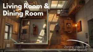

A Practical zoning ideas for a small living and dining room combo, covering furniture placement, rugs, and lighting. Includes a comparison table and real trade-offs.
Two Rooms, One Footprint: Zoning a Living and Dining Combo That Doesn’t Feel Cramped
A shared living and dining space is one of the most common layouts in small apartments and older homes, and one of the trickiest to get right. Without a wall separating the two functions, it’s easy for a dining table to feel like it’s crashing into the middle of the living room, or for a sofa to swallow up space that should be reserved for meals. The result is a room that never quite feels like either space is doing its job well.
Zoning solves this the same way it works in a studio apartment: using furniture placement, rugs, and lighting to create the sense of two distinct rooms inside one open footprint, without adding a single wall. This guide covers exactly how to do that in a genuinely small combo space.
The one thing to do today: measure the full length and width of your combo room, then sketch a rough line where you’d place a wall if you had the option. That imaginary boundary is almost always the best starting point for where your first zoning element, whether that’s a rug, a sofa back, or a lighting fixture, should go.
Why Zoning Matters More in a Combo Room Than a Single-Purpose One
A living room or dining room on its own only has to support one activity, so furniture choices are more forgiving. A combo room has to switch between relaxing and eating, often within the same hour, and without some kind of visual structure, the brain never quite registers where one activity is supposed to end and the other begins. That ambiguity is what makes a combo room feel cluttered even when it technically has enough space for both functions.
Use Furniture Orientation as Your Primary Divider
The single most effective, cost-free zoning tool in a combo room is simply how you angle your furniture. A sofa placed with its back facing the dining area, rather than pushed flush against a wall, creates an instant, natural boundary between the two zones without needing to buy or build anything. Guests seated at the dining table end up facing the back of the sofa rather than looking directly into the living area, which reinforces the sense that they’re in a separate, defined space.
This works especially well in longer, rectangular rooms, where the sofa can sit roughly in the middle third of the room’s length, dividing it cleanly into a living zone on one end and a dining zone on the other.
Anchor Each Zone With Its Own Rug
Rugs are one of the clearest visual cues for where one function ends and another begins, and they cost far less than any structural change. Placing a rug under the sofa and coffee table defines the living zone’s footprint, while a separate rug under the dining table marks that area distinctly. Using two rugs with a different texture or pattern, rather than one continuous rug across the whole room, reinforces the sense that these are two intentional spaces rather than one undivided room.
Keep both rugs low-profile in a tighter combo space, since two thick, bulky rugs can visually crowd a small room rather than help organize it.
Layer Lighting Instead of Relying on One Fixture
A single overhead light treats the whole combo room as one undivided space, which works against everything else you’re doing to zone it. Adding a pendant light directly above the dining table, positioned roughly 30 to 34 inches above the tabletop, gives that zone its own clear visual anchor. Pairing this with a floor lamp or table lamp near the sofa gives the living zone a light source of its own, so each area feels lit and defined independently rather than washed in the same single source of light.
Choose Furniture Scale Carefully
In a small combo room, oversized furniture in either zone can overwhelm the whole space. A large sectional sofa might work in a dedicated living room, but in a combo space it often leaves no room for a dining table at all. Scaling down, a loveseat or a compact two-seat sofa instead of a full sectional, and a round or extendable dining table instead of a large rectangular one, keeps both zones proportionate to the room rather than letting one dominate.
An extendable or drop-leaf dining table is particularly useful here, since it can stay small for everyday use and expand only when hosting guests, rather than permanently occupying more floor space than daily use actually requires.
Consider See-Through Furniture for the Dining Zone
Solid, heavy dining chairs and a chunky table can visually wall off the dining area from the rest of the room, making the whole combo space feel more divided and cramped than it actually is. Furniture with an open or transparent structure, like chairs with a slim frame or a table base that reads as mostly negative space, keeps sightlines open between the two zones. The eye can travel through the piece rather than stopping at it, which helps a small combo room feel more unified even while the zones remain clearly separate in function.
Add a Low-Profile Divider Where You Want Real Separation
If furniture orientation and rugs alone don’t give enough of a boundary, a low, open-backed divider adds a bit more physical separation while still keeping the room feeling connected. A bookshelf placed perpendicular to the wall, positioned between the two zones, offers storage on both sides while acting as a partial visual wall. A half-height console or credenza serves a similar purpose and can double as a spot to display decor or hold serving items for the dining area.
Avoid a floor-to-ceiling or fully solid divider in a genuinely small combo room, since blocking sightlines completely tends to make each zone feel smaller rather than more defined.
Use Mirrors to Counteract the Feeling of a Divided Room
Zoning a room into two functions can sometimes make a small space feel more cut up rather than more organized, especially if natural light is limited. A large mirror placed opposite a window helps bounce light through both zones, softening the sense of division created by the other zoning elements. This is a purely cosmetic fix, but it matters more in a combo room than a single-purpose space, since two zones sharing one set of windows often means less natural light reaching the far end of the room.
Keep a Consistent Color Palette Across Both Zones
While each zone benefits from its own rug, lighting, and furniture arrangement, keeping the overall color palette consistent across both areas prevents the room from feeling like two mismatched spaces stitched together. Sticking to a neutral base with one or two accent colors repeated in both zones, whether through cushions, artwork, or a shared accent wall color, ties the room together visually even while the zoning itself keeps the functions distinct.
Placement Matters as Much as the Zoning Itself
Where you place the dining zone relative to the kitchen and the living area affects how naturally the whole room flows. Positioning the dining area between the kitchen and the living zone, rather than tucked into a far corner, keeps a natural traffic path for carrying food and clearing dishes without cutting through the living space. Pushing the dining table against a window, when the layout allows it, is another effective option, since it uses an edge of the room that’s often otherwise wasted and frees up the central floor space for living room furniture.
Comparison Table: Zoning Approaches for a Small Living and Dining Combo
| Approach | Best For | Approx. Cost | Trade-Off |
|---|---|---|---|
| Sofa-back divider | Long, rectangular rooms | Free, just furniture placement | No cost at all, but requires enough room length to work well |
| Two distinct area rugs | Any combo room needing a visual boundary | 80 to 250 dollars for both | Clear zoning cue, but can feel crowded if both rugs are too thick or patterned |
| Layered lighting (pendant plus floor lamp) | Rooms with a single central light fixture currently | 60 to 200 dollars combined | Strong visual anchor for each zone, but pendant installation may need an electrician if no fixture exists |
| Open bookshelf or console divider | Rooms wanting more physical separation | 80 to 250 dollars | Adds storage plus division, but takes up floor space a rug-only approach wouldn’t |
| Extendable or drop-leaf dining table | Rooms where table size needs to flex | 150 to 400 dollars | Saves everyday space, but costs more than a fixed-size table |
| See-through dining chairs | Keeping sightlines open across zones | 300 to 600 dollars for a set | Keeps the room feeling open, but a bigger investment than solid wood or upholstered chairs |
Keeping Both Zones Functional, Not Just Visually Separate
Zoning a combo room isn’t only about how it looks. It also needs to hold up to daily use, meaning the dining area shouldn’t become a dumping ground for mail and bags just because it’s not fully walled off from the rest of the room. Treating each zone with the same intentionality as a separate room, keeping the dining table cleared between meals and the living area free of dishes, reinforces the zoning over time and prevents the two functions from blurring back together the way they would in an unzoned open space.